Shai's Work
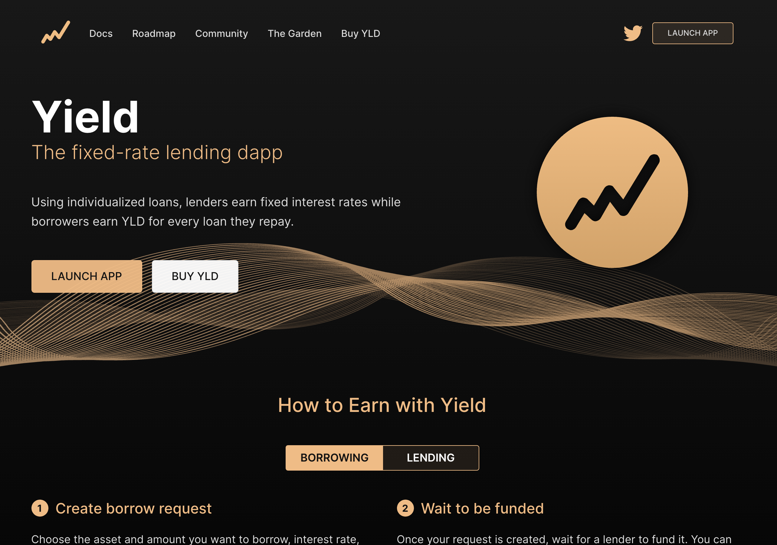
yield.credit
This site was also an rebranding effort to replace their SquareSpace site which didn't look terribly professional. I wanted to create something that was both professional, and simple, which is a reflection of the app itself.
Not only did I design and build the site, but I spent a lot of time thinking about the copy and how to convey the concepts behind the Yield dapp and its benefits over other competitors in the space. The site is broken down into two sections, one for each type of user – borrowers and lenders. I created a couple of SVGs that clearly convey the benefits to both user groups using both animations and interactivity.
I learned a lot about working with SVGs during this project, especially the GSAP JavaScript library which makes certain tasks for animating SVGs much simpler. For example, the animations of the logos in the hero section would be nearly impossible to do without GSAP.
I'm quite pleased with how the site turned out. I think it does an effective job of communicating the key points and giving Yield a sense of ligitimacy that the previous SquareSpace site wasn't able to do. The new design also brings the UI more inline with the web app, which I also designed.
Moving forward, I will be taking queues from this design to create branding to be used for social media posts and other marketing needs.
I coded and designed this site using:
- CSS3
- HTML5
- JSON APIs
- JavaScript + jQuery
- Photoshop
- Illustrator
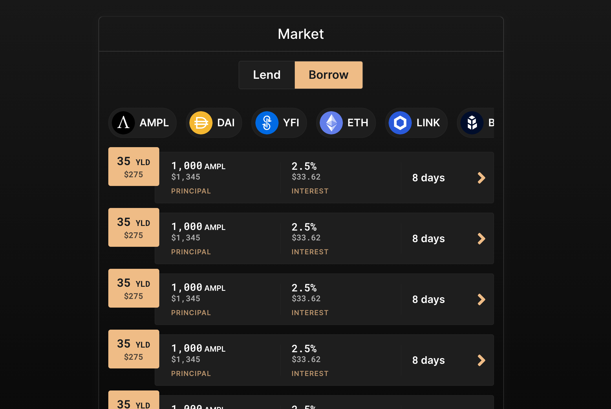
app.yield.credit
This UI was created in a non-traditional way, in the sense that I never touched a UX/UI app, but instead coded the UI from scratch. The developer preferred to proof the UI as a live site, so I mainly used CSS and HTML to code a click-thru version of the app. I never actually made a flat mockup, I just began by coding the landing screen and we went from there.
The goal here was the overhaul the previous UI from the beta version of the app. It used monospaced fonts exclusively and looked a bit like a console for that reason. The layout was alright, but the aesthetic would not have been pleasing for the average person to use. We kept many of the screens the same in terms of the information, but completely update the design, such as incorporating a sans-serif font, minimal use of colour, where necessary to convey status, and a bit of border radius to take the edge off (pun intended).
Once the dev had signed off an all the app screens, I handed him over the code so that he could plug it in, piece by piece, into the app. Althought not everything made it over, mainly a few of my hover effects, the app as you can see it today is essentially a carbon copy of my live mockup.
The app is now live and we occassionally gather user feedback to improve the UX as needed. In the first month, it has processed nearly $300k USD in loans and paid out over $21k USD in interest to the lenders.
I designed/coded this mockup using:
- CSS3
- HTML5
- JavaScript
- Illustrator
You won't be able to access all of the pages on the app unless you have connected it to your Ethereum wallet.
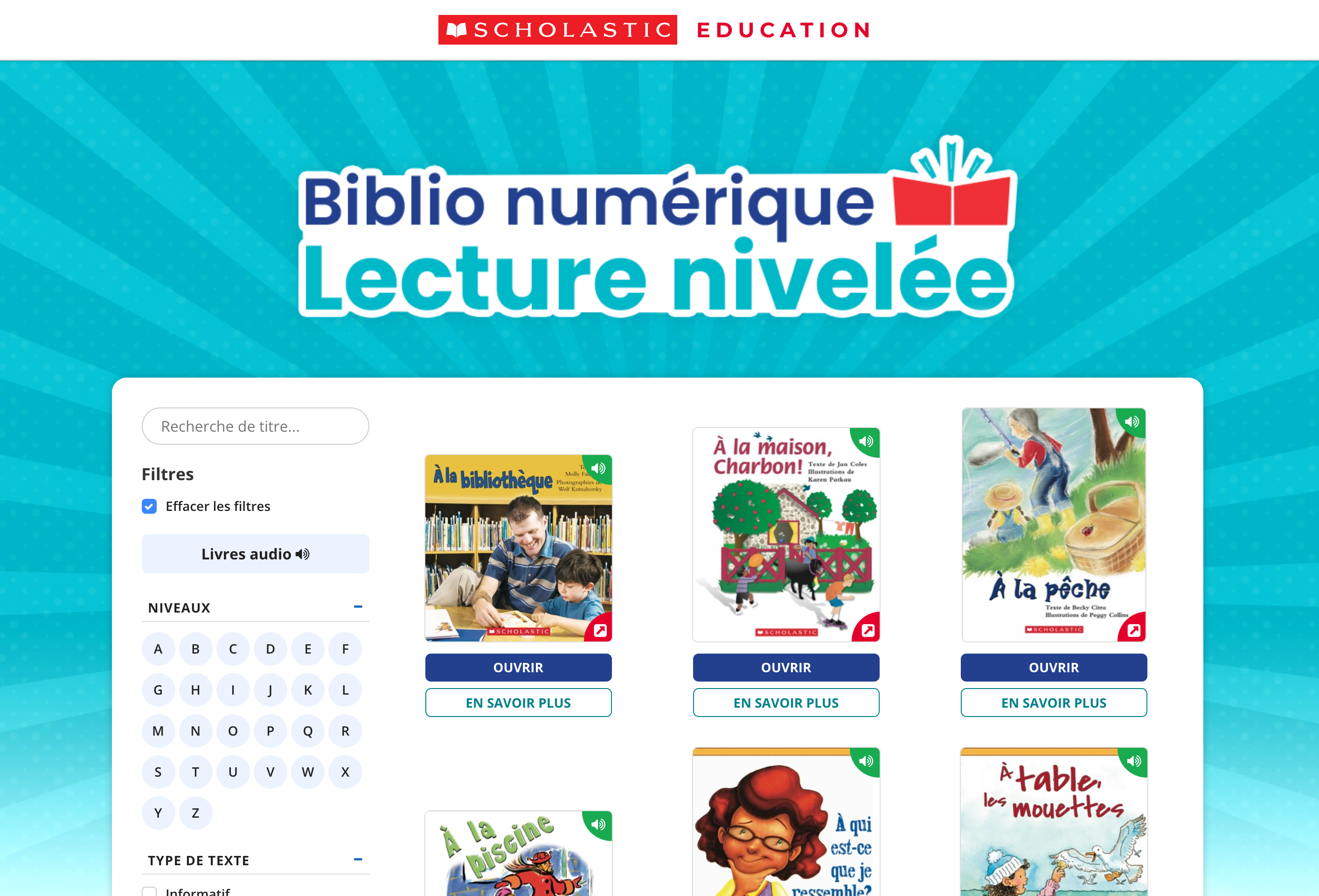
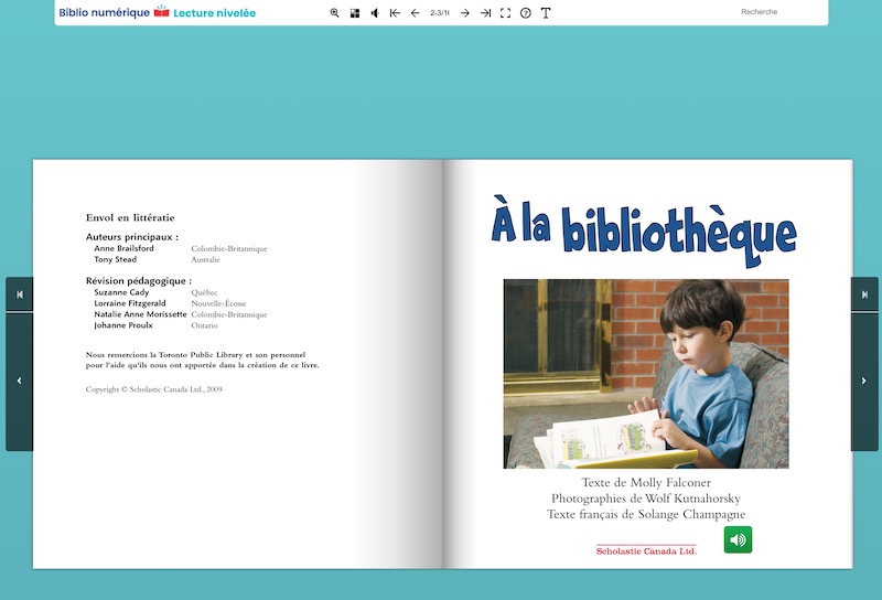
Lecture nivelée
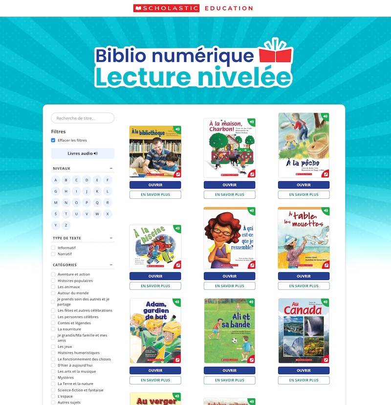
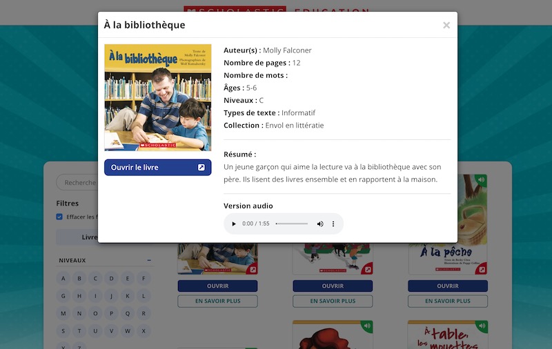
This website was built as an educational product for Scholastic Canada. Their previous site was very outdated and needed a major upgrade. I worked with internal stakeholders to create the site, from mockup to live site.
The focus was to make something that was bright and friendly for both teachers and students alike. I leveraged some flipbook software which allowed me to easily convert the original PDFs into interactive flipbooks with audio buttons for students to read along and learn new words.
The product is now in the hands of thousands of students, more and more each day. We regularly receive user feedback to determine what new features we should add and to ensure it's as easy as possible to use. I think the interface turned out very nicely and was kept as simplistic as possible. I utilized a sorting plugin to allow the users to quickly filter the hundreds of titles based on a number of different categories, taking queues from current eCommerce websites.
I designed/coded this mockup using:
- CSS3
- HTML5
- JavaScript
- Illustrator
You won't be able to access all of the pages on the app unless you have connected it to your Ethereum wallet.
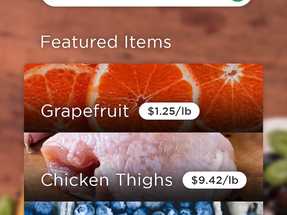
The Food App
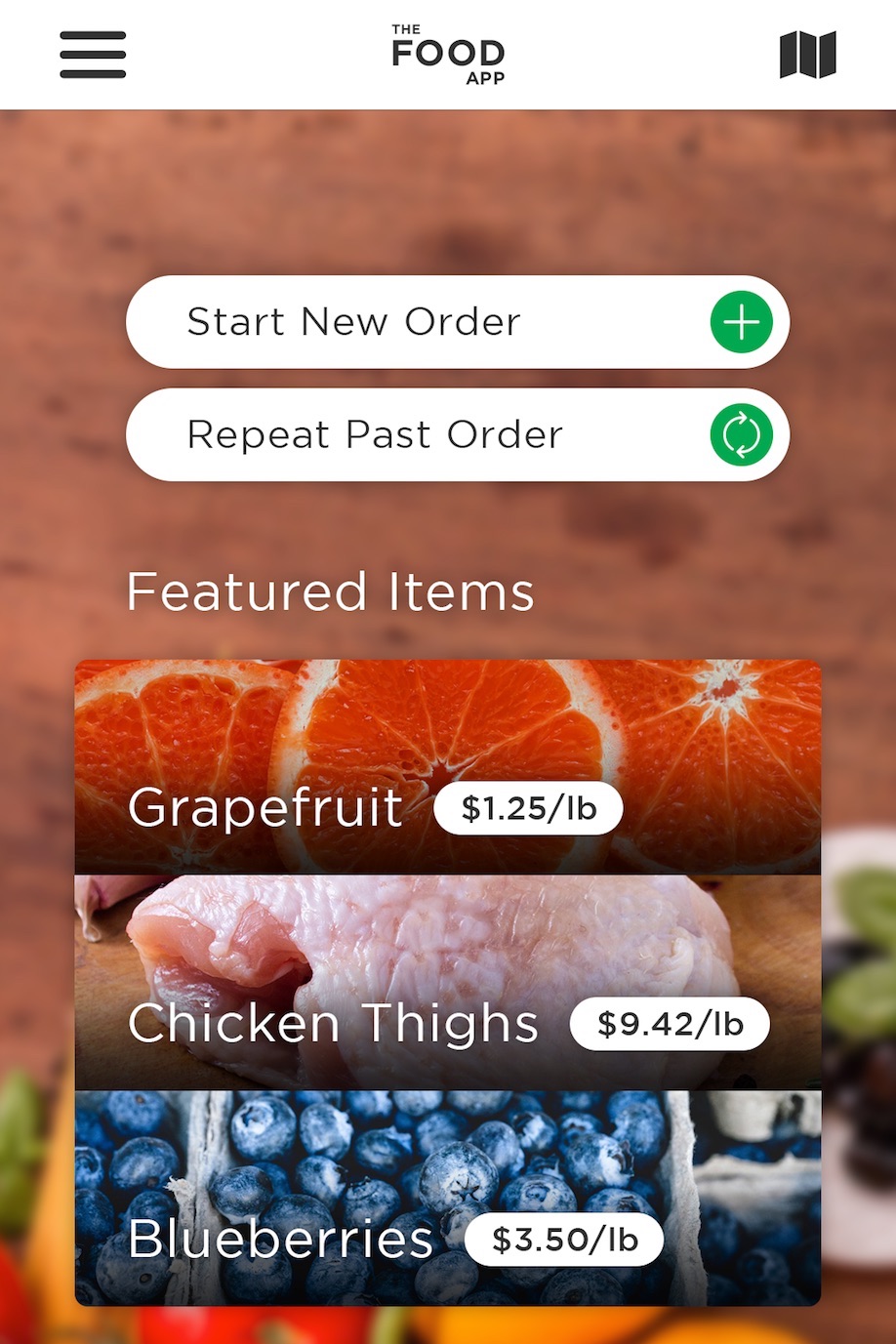
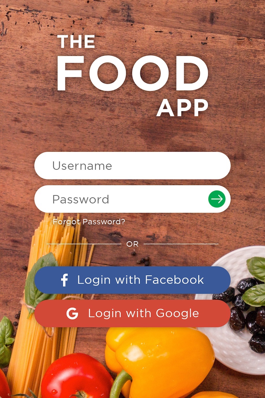
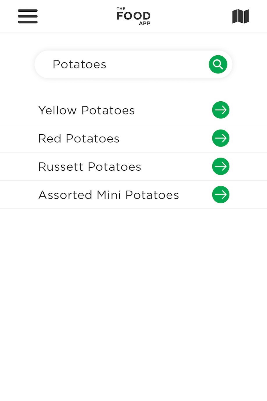
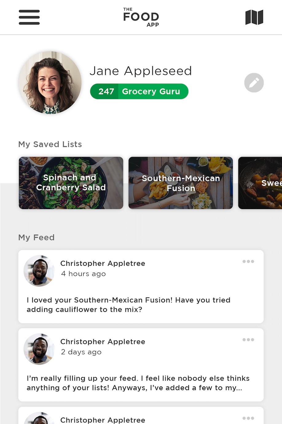
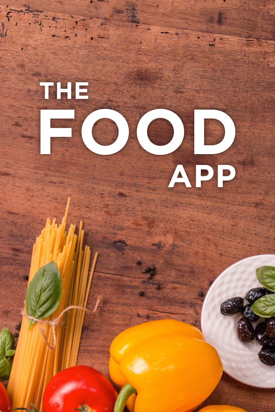
The Food App
This is a concept app I mockup up as an exercise.
Basically, it's an idea for an app that partners with grocery stores. You would order everything from within the app, then either go pick it up or have it delivered, depending on the services that store offers. You'd also have the ability to save different "lists" for items you purchase for different occassions, specific recipes, etc., and share them with friends
I've mockup up a few of the screens to give you an idea of how it would look.
I designed this app mockup using:
- Sketch
- Illustrator CC
For unrelated reasons, this client eventually decided to leave the company as a client. Due to the circumstances, although I did code this site completely, there is no live version that I'm able to show.
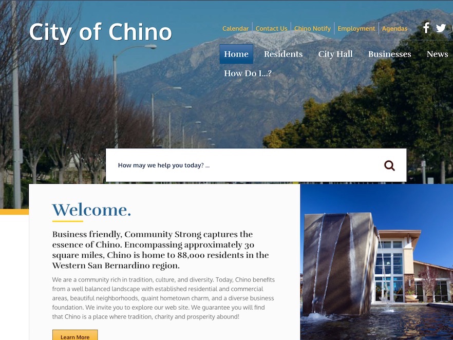
City of Chino, CA
I always enjoy coding a site that uses blue as its primary color, and a yellow as its secondary. I believe these two colors compliment each other better than any others, with the professionalism of the blue and the warmth of the yellow.
With this site, I used a few playful transitions such as those on the headings and news and events images, but omitted transitions on the buttons so that it wouldn't be too much.
I also used a subtle and slightly delayed parallax effect on the background images within the home page to bring it to life.
I coded this site using:
- CSS3
- HTML5
- XML
- XSLT
- JavaScript + jQuery
Live site may vary from original mockup. Revisions to designs are not uncommon after going live and, as such, other coders may have worked on it since.

Village of Buffalo Grove, IL
This site was built by myself, but designed by a colleague of mine. It's always a pleasure to code a site that is well designed, and done so by someone who also knows how to code it. I think that shows in this site, which was well thought out and conveys a clean, professional look that is well integrated with the village's branding.
To compliment the look, I tried to use tasteful CSS3 transitions that would not overwhelm or appear uncharacteristic of the site's refined look.
I coded this site using:
- CSS3
- HTML5
- XML
- XSLT
- JavaScript + jQuery
Live site may vary from original mockup. Revisions to designs are not uncommon after going live and, as such, other coders may have worked on it since.
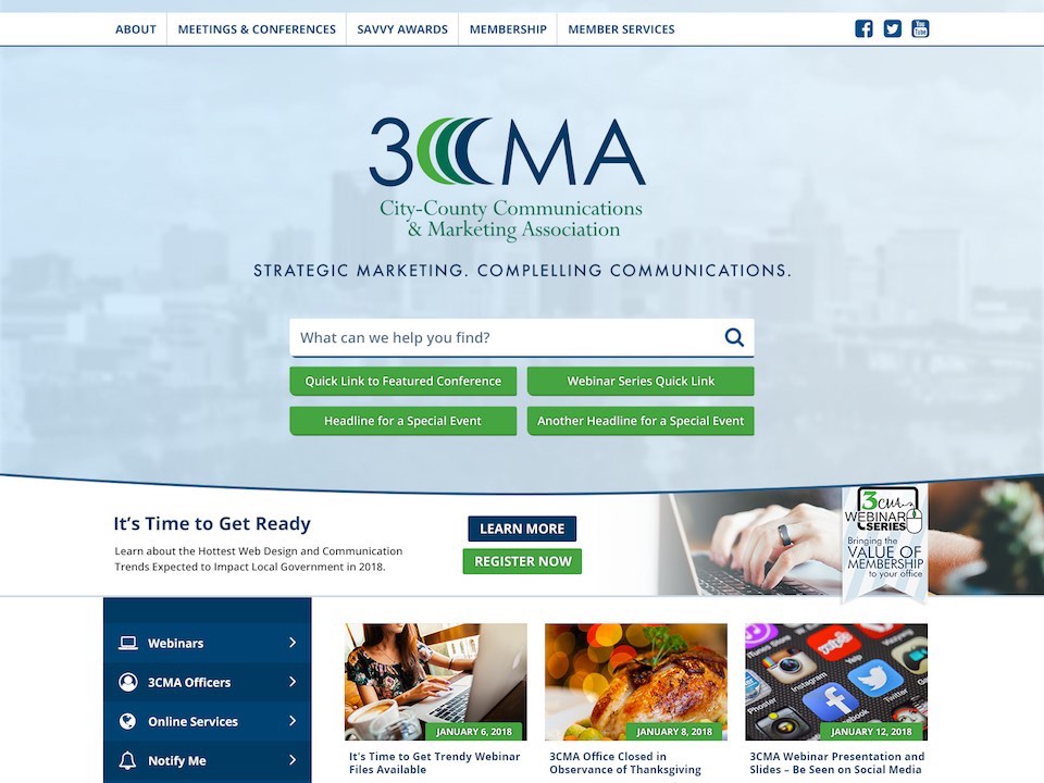
3CMA
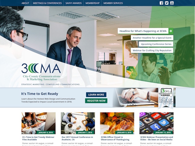
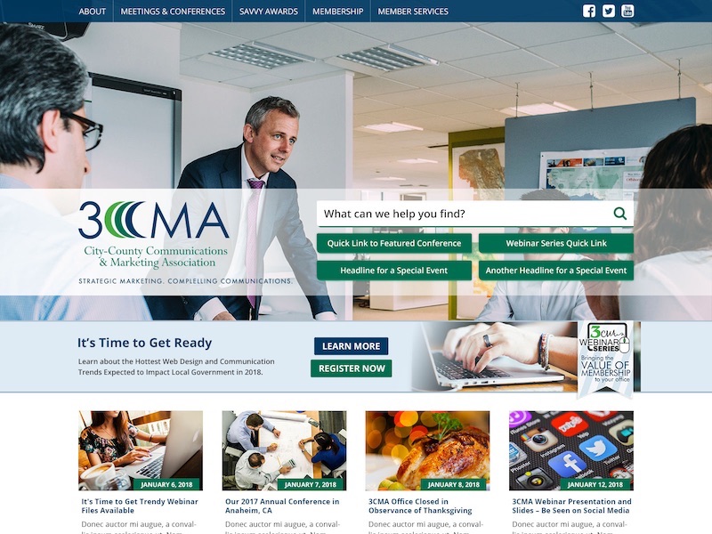
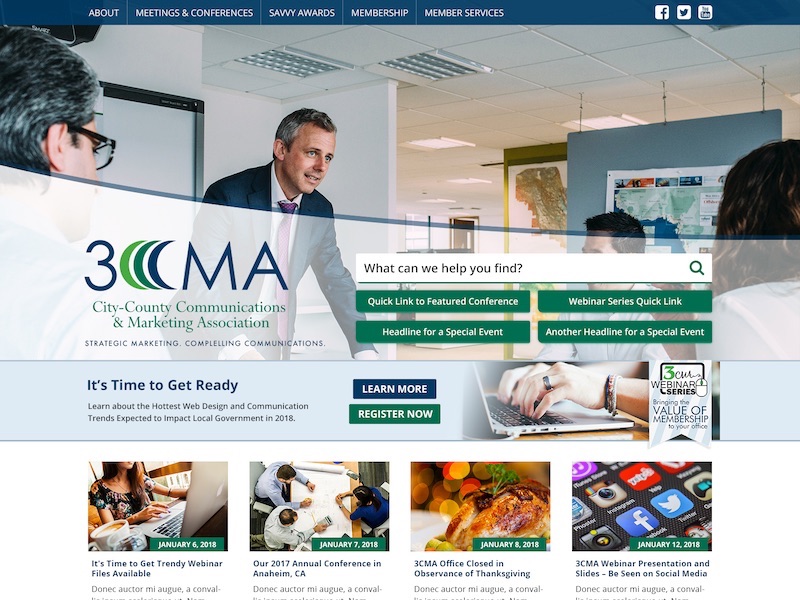
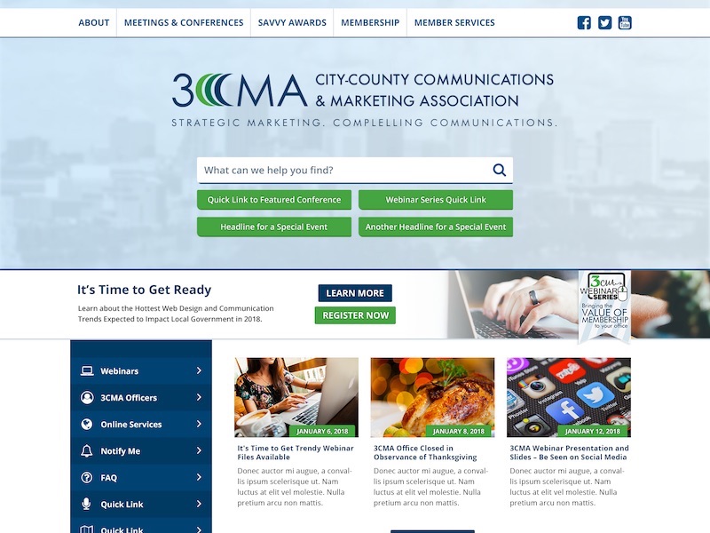
3CMA
This customer came to me as a rush job. They were not happy with the mockups they had received from another designer and I was required to make a new design from scratch before end-of-day.
Using feedback from their original design questionnaire, including a few example sites, I was able to create a new design and three variations to choose from. They were quite pleased with the results, and after a few small adjustments we had settled on a final version with which we could proceed to the coding phase.
I designed this mockup using:
- Photoshop CC
- Illustrator CC
For unrelated reasons, this client eventually decided to leave the company as a client. Due to the circumstances, although I did code this site completely, there is no live version that I'm able to show.
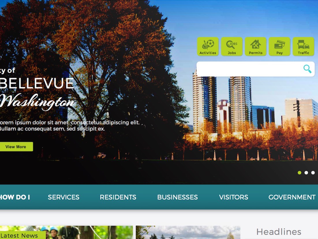
City of Bellevue, WA
Although the final site didn't come out as nice as the mockup on this one, I think it turned out quite well.
This project was a prime example of design-by-committee on the client's part, but it was a good opportunity to learn how to manage a difficult situation with many new design requests coming after the initial build was complete. From multiple menus on each page, to a complete redesign of the home page's header section, I learned when to stand my ground and when to give in order to balance the integrity of the site and the client's happiness.
I coded this site using:
- CSS3
- HTML5
- XML
- XSLT
- JavaScript + jQuery
Live site may vary from original mockup. Revisions to designs are not uncommon after going live and, as such, other coders may have worked on it since.
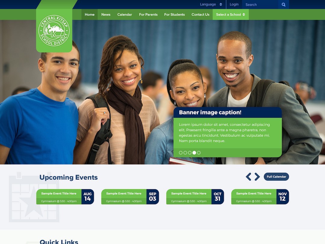
Central Kitsap School District

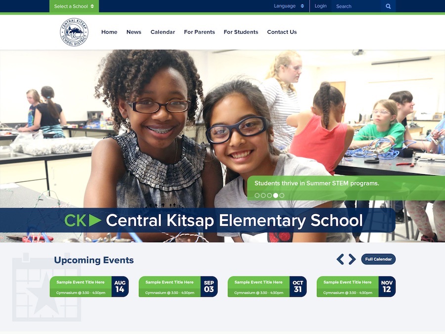
Although this was one of my earlier projects in my career, I feel it turned out very well. This was due, in part, to a client that I worked well with and that trusted my expertise.
They were looking for a clean, fresh look that reflected their school district's growing population and focus on technology.
As well as being one of my earlier projects where I was given full reign over the design, it allowed me to really develop my CSS skills, in particular CSS3 transitions.
I designed this mockup using:
- Photoshop CC
- Illustrator CC
I coded this site using:
- CSS3
- HTML5
- XML
- XSLT
- JavaScript + jQuery
Live site may vary from original mockup. Revisions to designs are not uncommon after going live and, as such, other coders may have worked on it since.

Jersey City, NJ
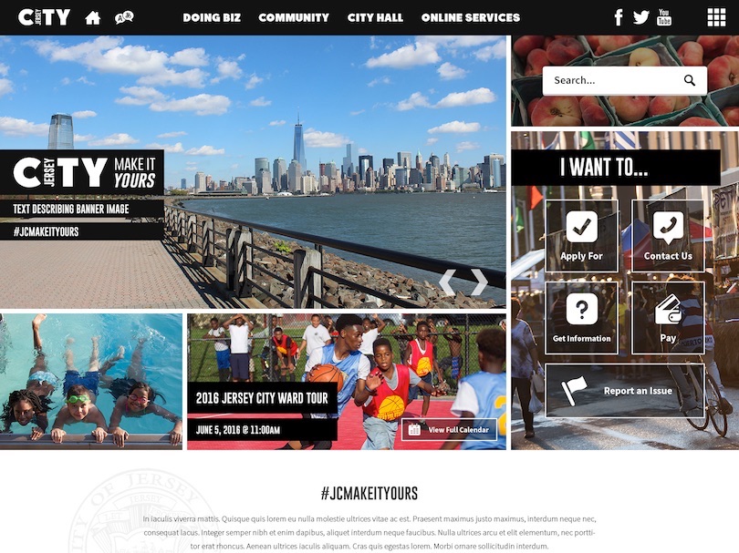
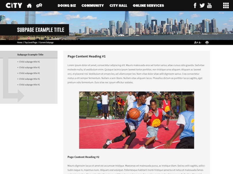
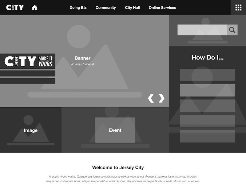
Jersey City, NJ
The goal of this design was to mockup a site that reflected the client's established branding. Using a variety of publications, websites, and other print media as inspiration, I created a unique design that fit all their needs.
One of the challenges was to use their dark, black and white branding while still allowing their text and imagery to shine through. My solution was to create an image-heavy, mosaic style hero section. This worked as a way to not only fit in many photographs of the city, but also to fit in quick links, recent news, and upcoming events all above the fold.
I designed this mockup using:
- Photoshop CC
- Illustrator CC
Live site may vary from original mockup. Revisions to designs are not uncommon after going live and, as such, other coders may have worked on it since.

Lee County School District
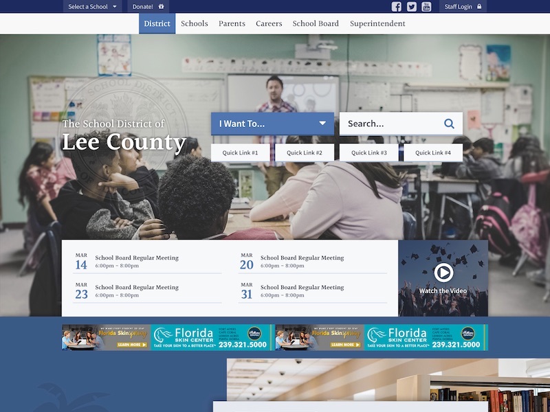
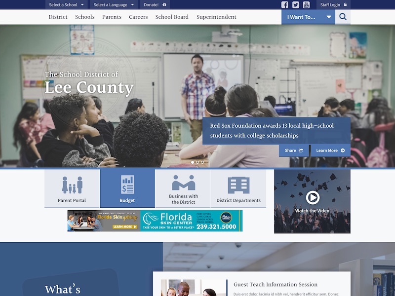
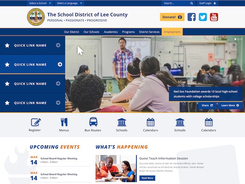
Although this project went through multiple mockups, we managed to create a clean looking website that shows off everything the school district has to offer.
This project enountered a few struggles, including some flip-flopping on the design from the client, and finding a way to indegrate advertisements without completely compromising the look and feel.
This project was able to be successful by seeing each revision request as a challenge and an opportunity to come up with new ideas, instead of trying mangling the old ideas into worse versions of themselves.
I designed this mockup using:
- Photoshop CC
- Illustrator CC
I coded this site using:
- CSS3
- HTML5
- XML
- XSLT
- JavaScript + jQuery
Live site may vary from original mockup. Revisions to designs are not uncommon after going live and, as such, other coders may have worked on it since.
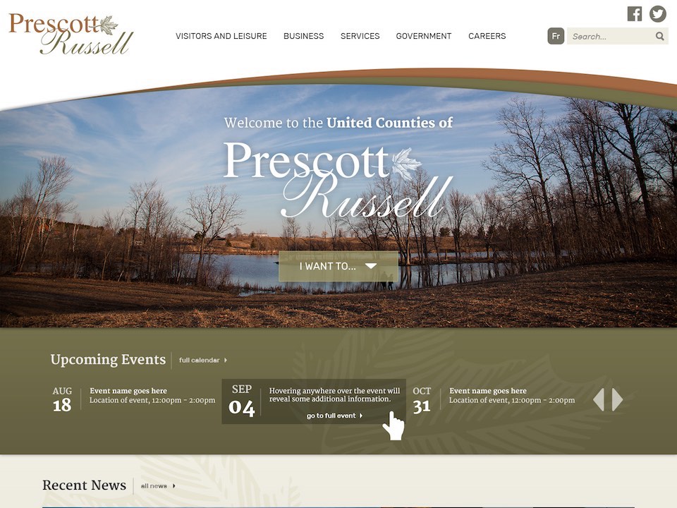
United Counties of Prescott-Russell
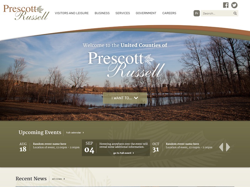
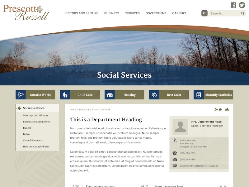
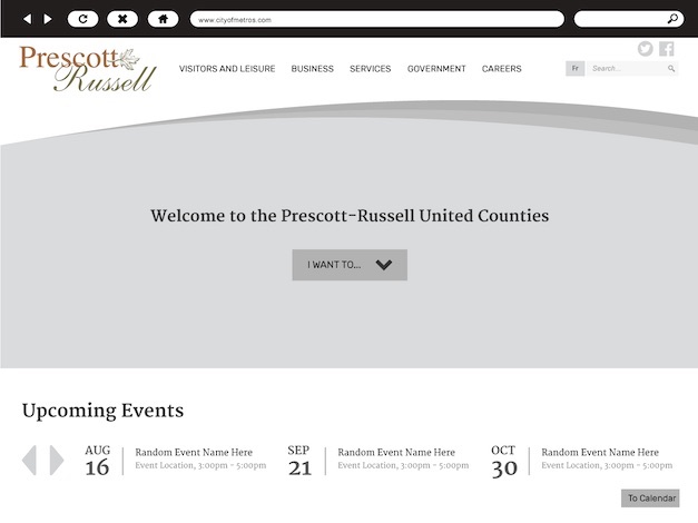
This client wanted something that borrowed certain design elements from their outdated website so as to keep it's heritage feel, yet using current web trends. I achieved this by borrowing their old site's earth tones and the curves seen above the hero section. Some more modern touches were the full width hero area, a prominent "I Want To..." dropdown, and simplified rows of content to keep the homepage welcoming and uncluttered.
Not only was this client pleased with the design, but the individual counties within their region came on as customers and opted to use the same design with minor differences.
I designed this mockup using:
- Photoshop CC
- Illustrator CC
I coded this site using:
- CSS3
- HTML5
- XML
- XSLT
- JavaScript + jQuery
Live site may vary from original mockup. Revisions to designs are not uncommon after going live and, as such, other coders may have worked on it since.
ShoutEm
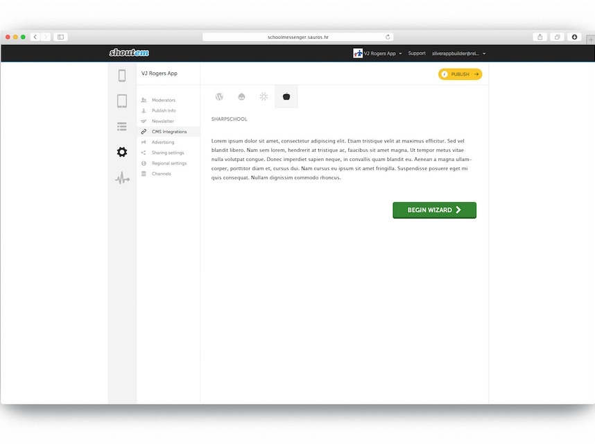
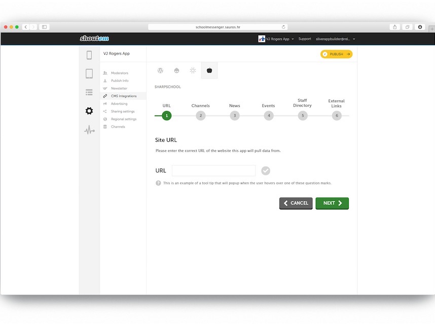
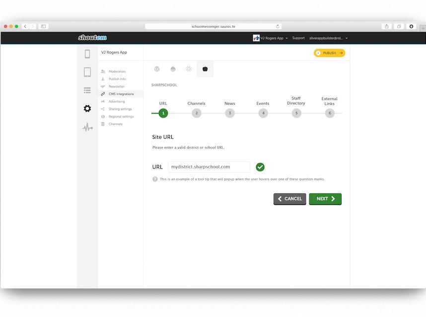
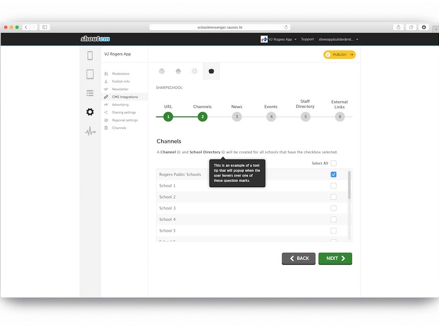
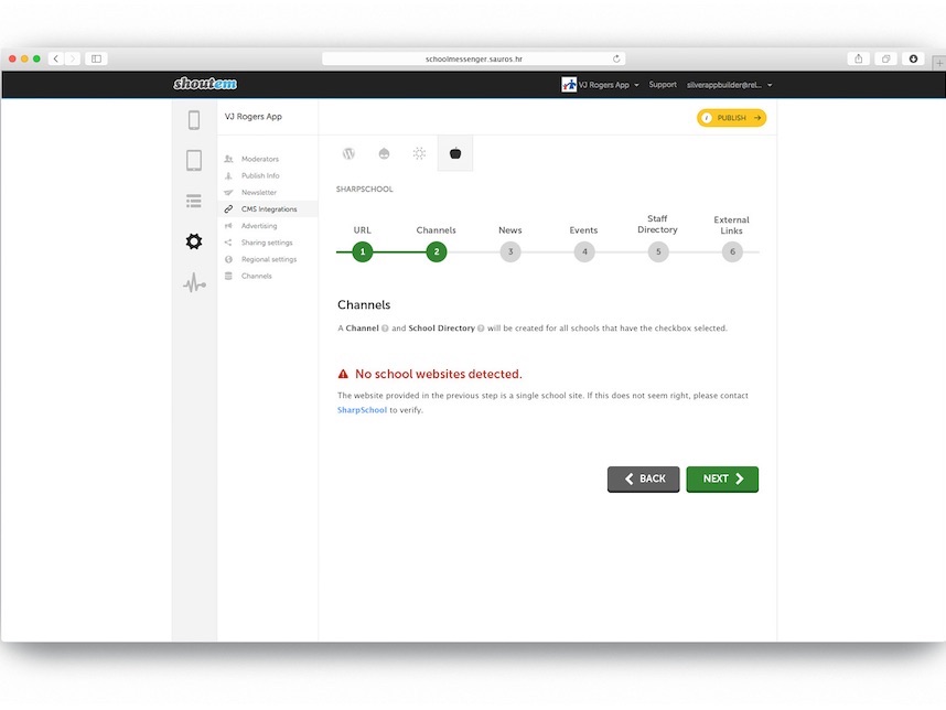
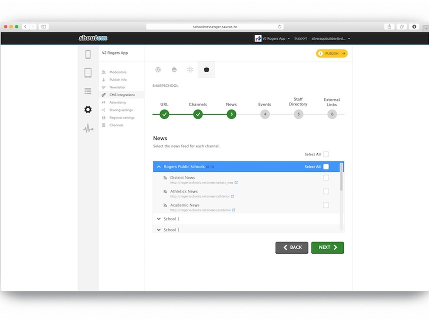

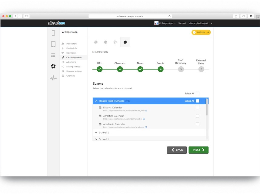
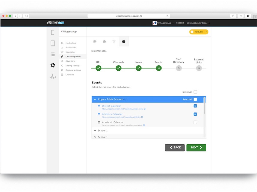
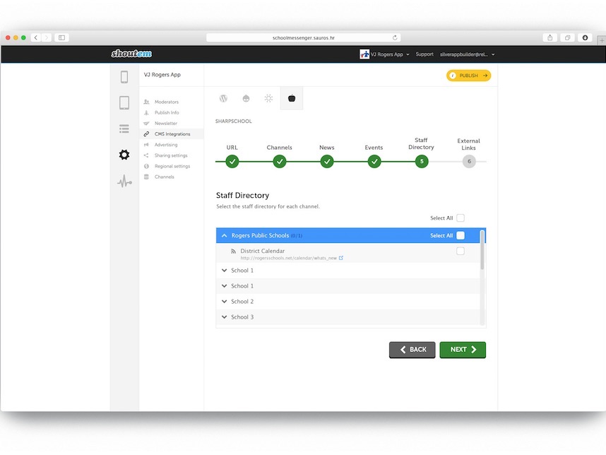

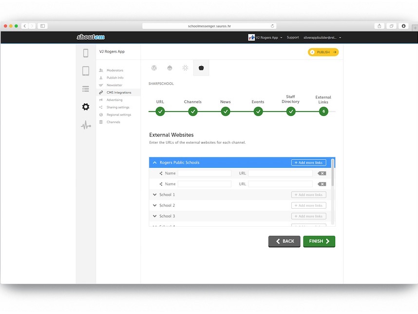
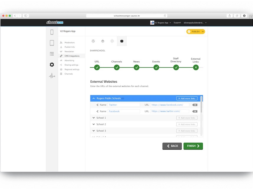
ShoutEm (Mobile App Builder)
Here, I was required to mockup the webapp screens for an mobile app builder that would take news, events, etc. feeds from school websites and integrate them into the native app.
The screens take you through each step, from selecting the schools, to choosing which news, events, and staff directory feeds you'd like to include.
I designed this mockup using:
- Photoshop CC
- Illustrator CC
Live site may vary from original mockup. Revisions to designs are not uncommon after going live and, as such, other coders may have worked on it since.
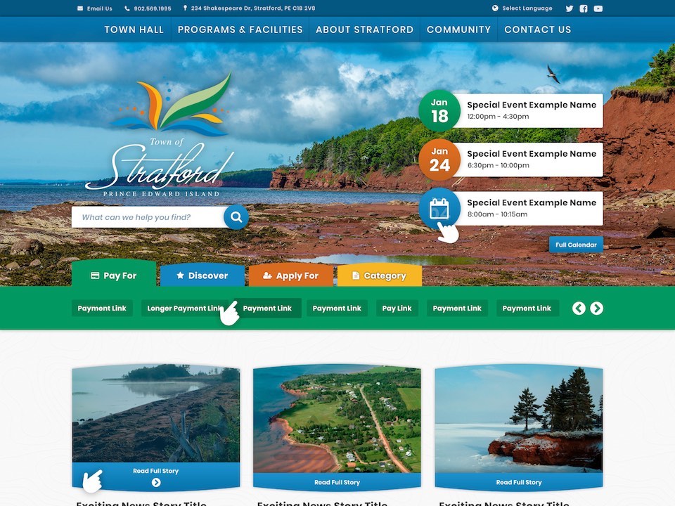
City of Stratford, PEI

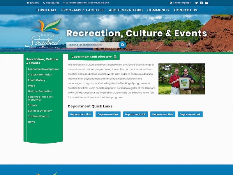
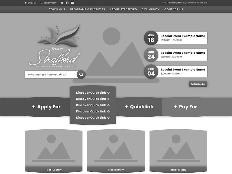
Being a small town in Prince Edward Island, this was not a large site. However, given that they had no prior branding materials to work with, other than a logo and colors, I was given a lot of freedom with the design.
They had a very cheerful color palette to reflect their beautiful, natural surroundings which I used to make a fun and inviting mockup. Because they did not have a ton of content to fill the pages, I opted to have a large header image on all pages to show off the great photography of the area.
I designed this mockup using:
- Photoshop CC
- Illustrator CC
I coded this site using:
- CSS3
- HTML5
- XML
- XSLT
- JavaScript + jQuery
Live site may vary from original mockup. Revisions to designs are not uncommon after going live and, as such, other coders may have worked on it since.
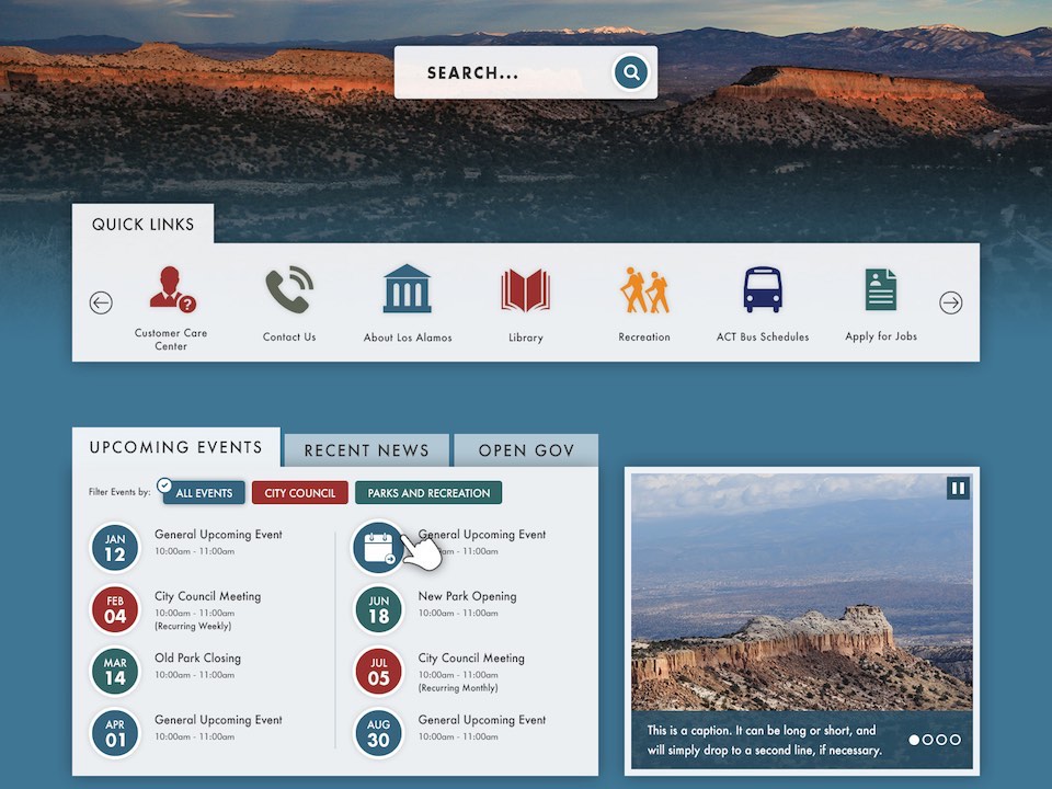
Los Alamos County, NM
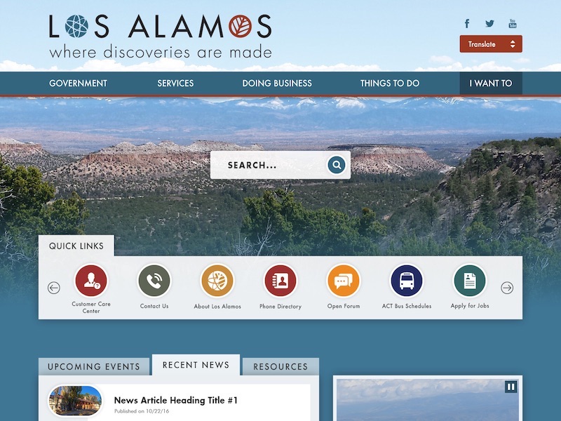
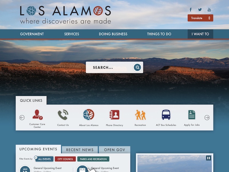
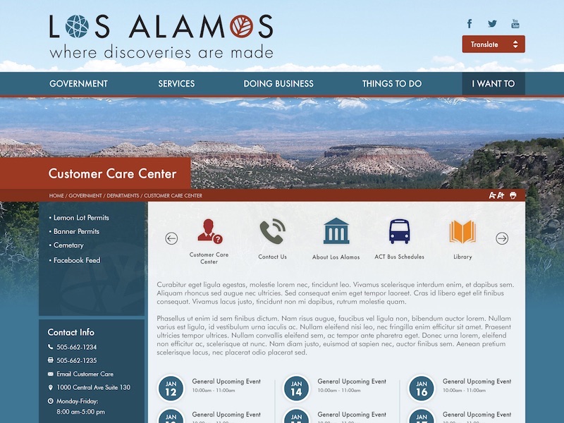
Being home to the Los Alamos National Laboratory, where the atomic bomb was developed in the 1940s, I knew I had to get this project right or face the consequences.
This being a rather simple website, I had some extra time to commit to the events filtering feature and various extra CSS3 transitions.
I designed this mockup using:
- Photoshop CC
- Illustrator CC
I coded this site using:
- CSS3
- HTML5
- XML
- XSLT
- JavaScript + jQuery
Live site may vary from original mockup. Revisions to designs are not uncommon after going live and, as such, other coders may have worked on it since.